Why Do Web Developers Often Set Font-Size to 62.5% for the HTML Tag?
In web development, many programmers often use a font size of 62.5% for the html tag. This is a good practice, but a recent post in a frontend group shows that not everyone knows why this is done, and why not simply set html { font-size: 10px } for convenience.
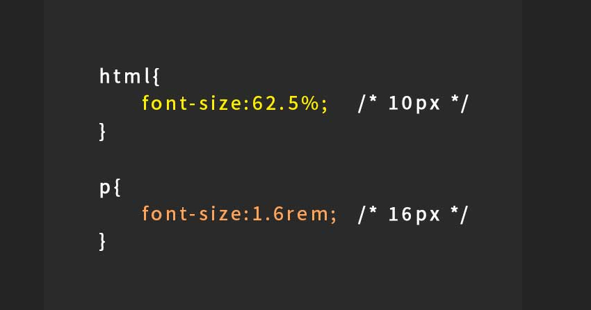
First of all, everyone knows that browsers have a default font size of 16px, so setting it this way makes calculations easier. For example, if you want 11px, you can just use 1.1rem.
But why do browsers have a default of 16px? Why not set it to 10 or 20 for simplicity?
It’s because 16 is a multiple of 2-4-8. If you notice, CSS frameworks also have sizes like 8-16-24-32, and so do UI design specifications. You can Google for more information on this.
So why not just set the font size to 10px? Why bother with 62.5%?
Because a value of 10px is always 10px on all devices, fixed at 10 pixels. On high-end devices with very fine screens, where pixel sizes are very small, 10px would be too small to read.
However, the percentage value based on the default 16px is different. It adapts to each device’s settings. Users can adjust the font size in their browser settings, making the pixels (of the default 16px) scale according to the system settings.
We can try the following code:
p {
    font-size: 20px;
    color: red;
}
h2 {
    font-size: 62.5%;
    color: blue;
}

<p>LapTrinhCuocSong.com</p>
<h2>LapTrinhCuocSong.com</h2>
When you go into the browser settings and increase the font size, the red text above will not change, but the blue text below will enlarge.
So, 62.5% of what?
We are writing CSS for the html tag, which is the largest tag, so 62.5% of what? Simply put, it’s 62.5% of the number calculated by the browser based on the system settings, browser font size settings, and other factors.
If you set the font size to “Very Large” in the settings, the actual size will increase, but by how much? There is no specific number as it varies by manufacturer and device. Those who have rooted and tinkered with Android devices would know this. Older phones with large screens but low-quality displays scale pixels to be eye-friendly, while Apple, with its fine displays, does the opposite, packing more physical pixels into one pixel to achieve the same eye-friendly effect.
Why set it for the entire html tag?
Because we want all font sizes, margins, padding, border widths, etc., to be consistent with each other. This avoids situations where a button is very large but the text inside is small. It ensures that the interface scales uniformly according to the user’s font size settings.